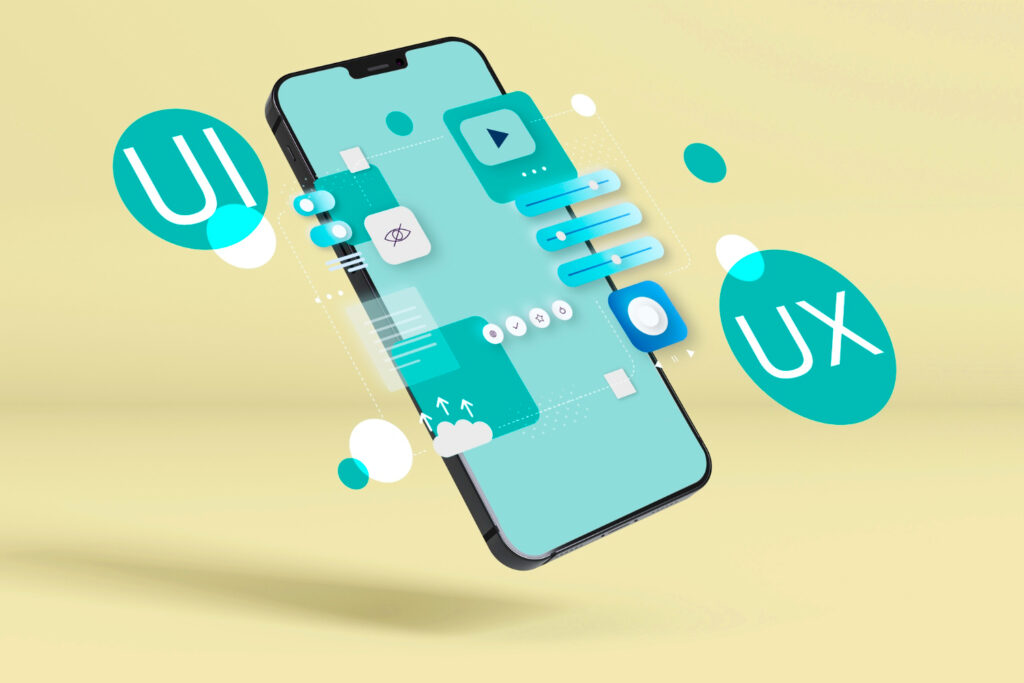
In today’s fast-paced digital landscape, user experience (UX) and user interface (UI) design have become pivotal in determining the success of websites and applications. As users spend increasing amounts of time on their devices, designers are challenged to create interfaces that are not only visually appealing but also functional and comfortable to use. A design trend that has gained significant popularity in recent years is dark mode, and in this blog, we will explore how dark mode design can enhance the UI/UX for the modern user.
The Rise of Dark Mode
Dark mode, also known as night mode or dark theme, is a design option that presents content on a dark background with light-colored text and elements. It marks a departure from the traditional light-themed interfaces that have dominated the digital world for years. The rise of dark mode can be attributed to several factors:
- Reduced Eye Strain: Dark mode reduces the amount of blue light emitted by screens, thereby helping to reduce eye strain, especially during extended usage sessions. This feature is particularly beneficial for users who spend long hours on their devices.
- Battery Savings: On devices with OLED or AMOLED screens, dark mode can significantly save battery life. In dark mode, individual pixels can be turned off, resulting in less power consumption, which is advantageous for mobile users.
- Aesthetic Appeal: Many users find dark mode visually appealing and modern. It often provides a more immersive and cinematic experience, making it a popular choice for media consumption apps.
- Accessibility: Dark mode can improve accessibility by increasing contrast and making text more readable for individuals with visual impairments. It also provides customization options for users who prefer high contrast.
Benefits of Dark Mode Design
Now that we understand why dark mode has gained traction, let’s delve into how it enhances UI/UX for the modern user:
- Enhanced Readability: Dark mode’s high contrast between text and background improves readability, reducing eye strain and making content more accessible.
- Improved Focus: The subdued background in dark mode helps users focus on the content, as it eliminates distractions caused by a bright screen.
- Reduced Glare: Dark mode is especially useful in low-light environments, as it minimizes screen glare and prevents your device’s screen from lighting up a dark room.
- Battery Savings: As mentioned earlier, dark mode can significantly extend battery life on devices with OLED or AMOLED screens, making it a practical choice for mobile users.
- Aesthetic Appeal: Many users find dark mode visually appealing and modern. It can give your app or website a competitive edge by offering a design that resonates with a wide audience.
Implementing Dark Mode Design
If you’re considering implementing dark mode design for your app or website, here are some essential considerations:
- User Preference: Always give users the option to choose between light and dark mode. Some users may prefer one over the other, so offering choice enhances the overall user experience.
- Consistency: Ensure that the dark mode design is consistent throughout your application or website. Inconsistencies can confuse users and disrupt the flow of their experience.
- Accessibility: Pay attention to accessibility guidelines and make sure that text remains highly readable in dark mode. Test your design with different screen sizes and resolutions to ensure it’s accessible to all users.
- Transition Effects: Consider adding smooth transition effects when switching between light and dark modes. This can create a more polished and enjoyable user experience.
- Customization: Allow users to customize aspects of the dark mode, such as text size, contrast, or color accents, to cater to individual preferences.
- Testing: Thoroughly test your dark mode design on various devices and platforms to identify and address any issues that may arise.
Best Practices for Dark Mode Design
To create an exceptional dark mode experience, follow these best practices:
- Choose the Right Colors: Select a dark background color that isn’t too harsh on the eyes. Consider shades of gray or deep blue. For text and elements, opt for high-contrast colors that ensure readability.
- Use Proper Typography: Pay attention to typography choices. Use fonts that are easy to read, even in low-light conditions. Adjust font weights and sizes as needed.
- Balance the Contrast: Maintain a good balance between the background and foreground elements. Aim for sufficient contrast without making the design overwhelming.
- Icons and Symbols: Ensure that icons and symbols are clear and easily distinguishable in dark mode. Adjust their colors and outlines to maintain visibility.
- Interactive Elements: Make interactive elements, such as buttons and links, clearly visible by using distinct colors or highlighting them when users hover or tap.
- Animations: Implement subtle animations to guide users and provide feedback. These animations should be smooth and not overly distracting.
Examples of Successful Dark Mode Design
Let’s take a look at a few examples of apps and websites that have successfully implemented dark mode design:
- Twitter: Twitter offers a dark mode option that transforms its interface into a sleek, dark-themed layout. The high-contrast text and icons make it easy for users to navigate their feeds and interact with tweets, even in low-light conditions.
- YouTube: YouTube’s dark mode not only enhances the visual experience but also saves battery life, making it a favorite among users who spend hours watching videos. The platform maintains consistency by offering dark mode on both desktop and mobile devices.
- Reddit: Reddit’s dark mode design is well-received by its user base. It features a dark background with white text and vibrant accents, providing a comfortable browsing experience, especially during late-night Reddit sessions.
- macOS and iOS: Apple introduced system-wide dark mode in its operating systems, allowing users to switch between light and dark themes seamlessly. This design choice has been praised for its aesthetics and practicality, as it benefits users on both Mac and iOS devices.
Conclusion
In the ever-evolving world of UI/UX design, dark mode has emerged as a valuable tool for enhancing the user experience. Its benefits, including reduced eye strain, improved readability, and aesthetic appeal, have made it a popular choice among modern users.
When implementing dark mode design, it’s essential to consider user preferences, accessibility, and consistency. By following best practices and learning from successful examples, you can create a dark mode experience that not only pleases your users but also sets your app or website apart in the digital landscape.
Dark mode design is more than just a trend; it’s a user-centric approach that caters to the needs and preferences of today’s tech-savvy audience. Embrace the dark side of design to provide a visually appealing and comfortable experience for your users in both day and night scenarios. With its numerous advantages and increasing popularity, dark mode is undoubtedly here to stay, enhancing UI/UX for the modern user. If you’re interested in delving deeper into UI/UX design trends, particularly the role of voice user interfaces (VUI), you may also want to explore our article on “Voice User Interfaces in UI/UX Design.